The self discovery throughout PPP this year has been immense. The chance to select my own live briefs to work on and contact artists that inspire me every day has developed me as a designer, giving me chances to create work I wouldn't have imagined and showing me that at a professional level, the work is complex but so rewarding and different each time. Being reminded why I am here on this degree is such a positive.
The interview process was far less daunting than I had imagined- spurred on by the motivational lectures, I made lists of artists I wished to contact due to their more niche style I aspire to, and messaged all of them with no hesitance. the questions I asked were inspired by our talk with John and it was down to what I wanted to actually know and get an experienced honest answer from, such as working for clients and how they gained popularity for their designs. Getting 3 long interviews with 3 really individual artists of different sectors visually stimulating work that is related to or has inspired artworks which have been put as the poster side for my interview posters.
Within interviews I was completely myself, even though they were through email. I never want to appear non engaging and boring with my questions or presence as I feel this is forgettable, and as they were email interviews I wanted to make it seem as real and chatty as it would face to face. From talking about music to getting excited and inquisitive about information I had read about them through research. I gave all artists the choice of wether to meet/skype or email, and it was most appropriate for all of them to email which I adapted to for them and made my language as expressive as I could, in which I received warm responses from all 3!
I had planned a studio visit to a local one in Leeds city centre from meeting one half of the collective but due to conflicting schedules this had to be cancelled, but will be revisited. This module is ongoing and I will continue to visit events and document them, a lot more through photography hopefully although developing film isn't very cost efficient so it is quite slow paced for now!
As for the live briefs, the ones I chose had to be in an area I wanted to explore more or challenge myself to such as a campaign for Thirsty Planet which personally paid off and I am proud of the collection and the phrases I created. Collaboration is an aspect I want to dive in to a lot more, as this is present in the industry even more so. Collaborating with different courses is a goal of mine and is inspired by the discussions and momentum gained by being in my collective AWOL. Unfortunately, I didn't get to collaborate with a different course this year however the project was still a success, except I want to learn from other courses and combine completely different skill sets which may be more stressful but rewarding.
The fact most of the exhibitions I have been to have been underwhelming may just be down to me and my style, but I definitely can see why I enjoy combining styles and clashing colours, as a lot of more clinical toned down design does bore me if too predictable. I like to inject puns, humour, pattern, etc, which I found was also the case in the fine art exhibitions I have visited which is reassuring. The most enjoyable events have been ones not restricted to prints in a row on the wall, but that become an experience which is more valuable.
Monday, May 8, 2017
Plans and goals for summer
This summer more than ever I am determined to keep designing and considering my future and university consistently! Absolute musts for summer are
-Look in to placement opportunities, in Leeds or Manchester. I need to find places that will elevate my skillsets and lead to the right opportunities for me, in which I want to find the appropriate studios. Starting in summer I feel is late already, so it is crucial I do this
-Continue my own design work-brush up my skills on my graphics tablet, keep drawing and painting,work to live briefs
-Complete work assigned for the start of year 3
-Find appropriate sources and decide on my dissertation question/topic
-Develop all my 35mm rolls and collate collections for zines next year which I want to publish and distribute, possibly exhibit
-Continue to network where possible and keep making links at exhibitions/events/socially
Sunday, May 7, 2017
Posters
These posters tie in my own practice and showcase my inspiration and interest in the artists creative sectors, working in similar styles they themselves work in and discuss within the interviews. Sending these to the artists will mean my work can be put out there and hopefully put up in their work space as a tribute and thank you to them for being so kind to let me interview them, as well as celebrating the interview designing them all in different styles unique to the artist. The typefaces, colours and background choices were all based off their work and this has allowed me to take completely different pieces of my work brought together as a trio of posters.
Creating posters opposed to online publications or otherwise allows me to send them a physical copy sharing my joy for collecting art posters, and I know they all sell prints and posters so this works in line with their practice also. They are all very different artists but creating these have brought them together whilst also collectively celebrating a style unique to them. Main points I have taken from the interviews are highlighted either in different typefaces or in bold to make the text more interesting to read whilst also pointing out key points. I was so lucky to get 3 amazing interviews with so much different advice, whilst also being in good discussion sharing my work and showing support.
These posters which will be sent out to the artists allowed me to bring together a variety of projects and give them a new meaning and purpose also, as none of them had much success in their initial purpose. To not be disheartened and keep trying and believing in my work is becoming a necessity and part of who I am as a designer.


PPP presentation
Since my presentation it has hit me, from seeing others, and also from the point I feel I am going on to third year that it is time to take control of the projects I choose like in responsive, my links socially and professionally, submitting work and getting work, all of these in which I have set goals for summer to complete. Crucial is to get an online presence as from interviewing some of my favourite artists, this is how to roll with it in terms of getting recognized especially on Instagram. Through every talk we have had also, online presence.
I feel I carried on my confident speaking from last year, although perhaps I missed a couple of key points out such as why I chose the briefs for responsive and identifying and contacting studios for placements and work.
I feel I carried on my confident speaking from last year, although perhaps I missed a couple of key points out such as why I chose the briefs for responsive and identifying and contacting studios for placements and work.
Wednesday, May 3, 2017
Neon Cactus,Reds True BBQ and Holy Matcha branding
Neon Cactus by Analogue
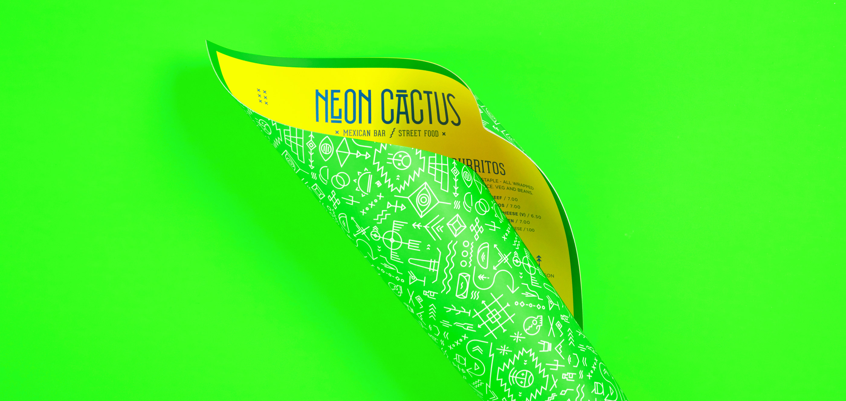

This menu instantly drew in my attention and creative eye in admiration for the electric minimal design of the rebranding, the way it has used symbols and mexican inspired type in such a clean way. This made me consider the design for my studio brief 2 for OUGD505, if I were to design for inside a club/bar, a way for my message to stand out without looking too tacky.


This menu at Reds True BBQ is a perfect example of a brilliant design concept all tied together, making the menu bible related. This is another way I have taken in that publications should be unique and informed to embody a concept and make it stand out, as well as stock considerations. Creating a publication earlier in the year did not go very well as it wasn't thought out enough, and it has taught me to always have other options.


Haven't not ever even tried or heard of Matcha before, this branding stood out to me instantly on Instagram and reminds me of my self branding from last year but so much more clean and elegant. I feel like it would be me if I were a cafe!! This cafe has got so much attention and attendance just from the interior and identity of it; consistency and really pushing a design can benefit a company so much. Even the quilted stock, food detail, the walls all prompt people to take pictures and share spreading the word which is amazing for the business. I would like to take ventures like this on in the future and reminds me of how much I enjoy graphic design and the pushing concepts! This typeface also became the same one used in my collaborative brief which worked perfectly as it has a clean feminine flick to it.
Love/hate relationship with screenprint
 >
>


i first went wrong with screenprint for being impatient and not being a perfectionist when it came to printing the pieces which really put me off doing screen print ever again, as well as complications and mistakes with learning how to use the screen and mine being taken playing a role. I realised after submission however that the underlying issue was that I wasn't designing the appropriate cover for my publication which brought down the entire publication, and could see clearly after submission when I wasn't clouded by stress and frustration how it could have been done successfully.
Although I said to myself I would avoid it at all costs as I enjoyed monoprint and linoprint which are methods not as popular- after visiting an exhibition focusing on music posters screenprinted, it reminded me of why screenprint is so popular and still is to do this day despite advancing digital options- the results are unique and beautiful, and I actually learnt how to screenprint through learning from mistakes from the first time round which was annoyingly beneficial, meaning this time round I was a lot less stressed and more willing to experiment with gradients and try different designs and colours.
It is often very hard to take multiple risks such as screenprint with my grades and confidence at stake but I have learnt from this that I am still learning and it was a benefit going through that at the beginning as from feedback, my west indian carnival piece is different and has captured the energy of the festival. I wasn't happy with many of my prints but I still aim to see this as decent progress.
Subscribe to:
Comments (Atom)