Neon Cactus by Analogue
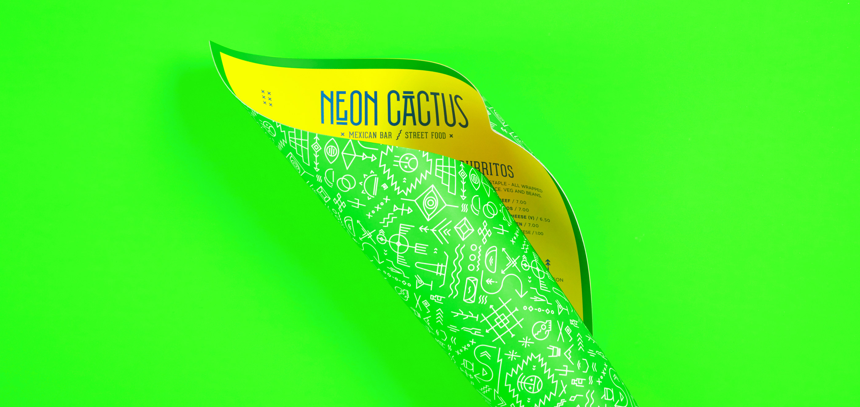

This menu instantly drew in my attention and creative eye in admiration for the electric minimal design of the rebranding, the way it has used symbols and mexican inspired type in such a clean way. This made me consider the design for my studio brief 2 for OUGD505, if I were to design for inside a club/bar, a way for my message to stand out without looking too tacky.


This menu at Reds True BBQ is a perfect example of a brilliant design concept all tied together, making the menu bible related. This is another way I have taken in that publications should be unique and informed to embody a concept and make it stand out, as well as stock considerations. Creating a publication earlier in the year did not go very well as it wasn't thought out enough, and it has taught me to always have other options.


Haven't not ever even tried or heard of Matcha before, this branding stood out to me instantly on Instagram and reminds me of my self branding from last year but so much more clean and elegant. I feel like it would be me if I were a cafe!! This cafe has got so much attention and attendance just from the interior and identity of it; consistency and really pushing a design can benefit a company so much. Even the quilted stock, food detail, the walls all prompt people to take pictures and share spreading the word which is amazing for the business. I would like to take ventures like this on in the future and reminds me of how much I enjoy graphic design and the pushing concepts! This typeface also became the same one used in my collaborative brief which worked perfectly as it has a clean feminine flick to it.
No comments:
Post a Comment