Thursday, December 1, 2016

Record Store exhibition


This exhibtion was curated at The Brunswick by fellow LCA student Alec, demonstrated how far you can take your work if you are passionate enough about it and the array of visitors it can attract. Although it was a simple layout, a lot of time and effort had been put in to it and a lot of thought, the vinyl player and the records to put on for example was a brilliant touch. It is encouraging and I definetly want to attend fellow students exhibits to build community and links to local creatives, and that just showing your work publicly wether it be at a venue or online, you are going to attract audiences you couldn't imagine.


Sunday, November 27, 2016

Idea generation group task


Working with Level 6 Fashion student


I responded to a call out for students who have been ridiculed for the way they dress before, which I experienced in high school due to being more gothic and having a stretched ear etc. I had seen her unique style of illustration and really wanted to help her and be involved. I love illustration, and we never meet students from fashion so I wanted to grab the opportunity to help a talented student and get an insight in to third year. She gave me guidance and highlighted you get to work with your own style a lot more, which is exciting as I saw her style fully thriving giving me an insight in to third year.


Wednesday, November 16, 2016

Branching out in industry initial thoughts

LCA 170TH party at Belgrave- attended to try and speak to alumni and have our faces recognised, spoke to a previous student who arranged the event
Possibility of working for producer- local producer who works a lot with Leeds College of Music students has seen my sent over work and is keen to get designs going after putting my designs forward and the musicians liking it
LCA student collaborations/Leeds student collaborations- part of both the very active Facebook groups on which I found the producer previously mentioned
Recognizing creative when out- at a hip hop gig at the front I noticed two creatives I follow on Instagram and wanting to talk to them about how they got their name known locally so well and for their advice possibly friendship, but it was too busy. However, this has spurred me on to definetly speak to these people if I do notice them at an event
Lord Whitney- get in contact as they are basically what I aspire to be and are so local
Secret 7 judges
Amsterdam design studios-
visiting Amsterdam very soon and am keen to visit as many design agencies as I can for a different perspective location wise, inspiration, etc and I have been encouraged to get numbers
Alphabet- would be amazing to have links in both cities I live in, Manchester and Leeds and they have done so well. Also came to speak to our year group last year and were very humble talented guys.

Friday, November 11, 2016

Upcoming events of interest

Picking events of relevance in year 2 is crucial in understanding my aesthetic and approach to displaying my work and the target audiences, and how to put work out there successfully. Events of interest that I will be attending this year include...

Tetley's Third Birthday

WEDNESDAY 30 NOVEMBER, FROM 6PM
Opportunity to meet other creatives and network as the tetley is one of the most popular hubs of exhibtions and creative events
Closer still- otley road
2nd-3rd december
fine art/photography combined exhibition, my two personal favourite art practices

AGE OF THE ZEAL- THE FENTON 

THURSDAY 10TH NOVEMBER 8PM
FINE ART STUDENT CURATED IN COLLABORATION WITH DRAG ARTISTS AND FELLOW FINE ART STUDENTS
VISUAL COMMUNICATION/EVENT MANAGEMENT

FILM POSTERS EXHIBIT- THE NORTH BAR
19th to the 29th november
poster design is one of my favourite aspects of graphic design, designing for covers or events as many medias can be combined to make memorable bold imagery. i collect flyers i find inspiring artistically, regardless if i like the event or not as it inspires my practice on this graphic design course

HIP HOP ART EXHIBITON, symons house
'An evening presentation of art inspired by the culture of Hip Hop from a selection of local and national artists including Trik9, King Monk and Agent M.'

The evening is free and will feature an opportunity to meet the artists and discuss their work. 

Unfortunately this event clashed with Age of the Zeal which was unfortunate as I want to explore hip hop art in more depth and the opportunity to speak to the artists would have been more out my comfort zone and very informative. In future I will try and go to both if they are both of interest and beneficial.

Who to contact

Interest in art direction/creating band identity theme/album artwork

Secret 7 judges/winners
Lord Whitney
search LinkedIn for music industry/design/art direction
Lippy magazine
instagram artists
grafitti artists/designers

I will screenshot instagrams for potentials to get in touch with and this will give me a comprehensive list and idea of who is more relevant to my goals

Age of The Zeal Exhibition


As discussed in my presentation, my favourite exhibition yet again by one of our fine art students due to the attire worn by guests, the decoration and creative set up of the space done by Holly herself, the entertainment and DJ's as well as projection of art was unbelievably fun and interactive and although just a box room it was turned in to another world! This has prompted me to speak to more fine art students who I really want to collaborate with at some point as fine art would be my other degree choice! The whole trash/glam/drag/dress up aesthetic of the exhibition is fascinating and just so different, it has directed my thoughts for what to focus my dissertation on and explore subcultures/other ideas of femininty and identity.

Thursday, November 3, 2016

Responsive: past entires and winners inspiration

YCN

http://blogs.arts.ac.uk/chelsea/2015/06/12/ba-graphic-design-communication-students-win-11-awards/


http://graphicdesign.lincoln.ac.uk/2010/06/01/ycn-awards/


D&AD

http://www.digitalartsonline.co.uk/news/creative-business/dad-awards-2016-winners/


Responsive: briefs of interest

YCN

UK Greetings- a chance to create a consistent, bold, daringly different and array of unexpected patterns/designs/language for wrapping paper, cards, gift dressings. Is an opportunity to use my excitement and positivity through language and direct myself to contacts or possible opportunities to have a portfolio for potentially going in to a similar career as my intentions as a designer are to be daring, bold, positive and colourful.

BEAR- very important ethics within the company which is having a positive impact on todays youth. I also feel my style can be very child based due to easy goingness and fun combinations of colours I enjoy using. Would have to buy some BEAR products as it was not around when I was younger when healthy eating began being really pushed, to see what the Yoyo cards and packaging is already like to make sure I have a strong idea more likely to be successful.

Thirsty Planet- bottled water company which needs a bold campaign to make it stand out, 'Thirsty Planet spring water sells through retail, food-service and vending partners. With many independent and major retailers proud to supply Thirsty Planet, including Waitrose. It is also available in restaurants and catering outlets including Peyton and Byrne, Bartlett Mitchell and Gaucho restaurants'
seems like it is placed in quite middle class establishments meaning the design can't be too outlandish or tacky, has to be well done. I see the potential of it being aimed at 18-24 year olds to play on the idea of a herbal essences style ad with that kind of humour, maybe the feeling of refreshments being in the shower or jumping in a pool etc and the ethics of a guranteed donation every purchase can tie in with those donated having the same refreshment which needs to be universally relatable like being in water is. Quirky hipsters. Blue and silver. Black and white, subtle to make unchildish. Look at expensive packaging, 'fancy'


D&AD
Adobe- i absolutely love doing poster designs and firmly believe people take more notice of them than they realise, and can have such an impact within the 578x370mm dimension and as it is about giving a message without words many methods can be used that I want to further experiment with such as my love for photography, methods such as monoprints and screenprints which can have interesting crazy effects, or a combination of all. Especially on board with the 'fun and life afirming' theme as this is one of my goals as a designer to spread this across the world as people really do need positive reinforcement.
Recreate scenes of familiarity for whichever target audience so it is relatable and the message instantly snaps

Penguin
Adult Fiction Cover Awards-  To Kill A Mockingbird I feel is such an amazing story , the existing covers are so traditional and flat I feel maybe a vintage style but new take for a cover would be appropriate. Strong use of typography and to stand out amongst all others like so many feel the book does. Winning a placement aswell is such an amazing chance of entering in to an amazing world renowned company.

On the other hand, doing the childrens cover award would be more enjoyable for me as a designer to work on as I feel it gives me more freedom and chance to explore my more abstract non serious ideas with the use of brighter colours and illustration to make it stand out to a young child on the shelf which is essential!

Thursday, October 13, 2016

Make Your Own Luck - Kate Moross

seeking advice for one of my favourite designers, not only her work but her drive personality and whole vibe

art school chapter

-always add extra to a brief. if its a poster, make a series. if its a brand identity, sketch out a website and set of stationary to compliment your work
-crits are essential for learning to communicate your work which is extremely important
-trust your instincts as a designer
-experience is as important as a degree
-set time aside for working on your own projects expanding portfolio is essential
-learning software is essential always
-over time your style emerges, remember that trends come and go, find your own
-doesnt always have to be inspired by something, doesnt need a reason if you enjoy it

First year PPP challenges

As this was the first time the future had seriously been brought attention to, getting the task to make a presentation on where we see ourselves in 10 years time I suddenly felt rather shit because...
-I am amongst strong creatives who have distinct styles and work experience/connections already so i felt behind
-People didn't seem like they'd stray far from becoming an actual graphic designer which I can't see myself as being
-i didn't know many design companies or graphic designers to relate to
-I tend to go with the flow and never set life goals as such
-not fitting in with the 'norm' style

Also while creating our own brand i realised my lack of confidence when it comes to arranging events held me back slightly as my idea was going that way but i have a fear of the failure of organising events and them going wrong...

I also changed my branding a lot which was quite stressful and looking back I really enjoy and relate to the design but the brand name and some aspects were a little over the top...although i see my designs as sometimes over the top, I have learnt that simpler sometimes looks a lot better and clearer

I also learnt from my end of year presentation that i can be a confident and engaging presenter which really uplifted me in so many ways!! was very proud of my feedback. I learnt to embrace my more flamboyant ideas, to ignore the mainstream trends as this course is so much more than modernist graphic design, and was pushed and spurred on to recognize styles and designers that I want to follow such as Kate Moross  on their creative paths and I will never not follow an awesome designer/creative on instagram now! I also need to think about the path before the goal of being an art director and knowing what kind of art direction I want to get in to...

Monday, March 14, 2016

Punny Packaging

A method you'd perhaps call it, of relatable funny and praised design is to use puns as the names or art direction for packaging or branding.

I have always seen these and been like, ahaaa clever! But until graphic design became part of my life at University, I didn't praise it as deeply as I do now as an inspiration. Having done a project similar in my graphics class at college, I realised very quickly this can be a brilliant way to come up with ideas if stuck on names! Down to earth, quirky, memorable and fun. My kind of design inspo!

Ben and Jerrys


Delicious design and fun packaging that has the famous brand and layout consistent, but having light hearted illustrative colour popping worlds related to the flavours in the ground of the titles.

Soap and Glory

I feel like the people who design these are ones I would love to work with. Very girly, retro inspired clever plays on sayings, I think the packaging and advertisements are outstanding and I enjoy having the products laying around my flat because they look that good and are very me! From seeing my self branding this is easy to see, and shows girly can be successful and appreciated by all when done right.


Br:eak and The Brunswick exhibitions

Although very useful to go and visit, which I need to start doing again, these exhibitions weren't what I was expecting.


 Although a very interesting location in an old warehouse kind of place, due to it being so big, the small amount of attendees was evermore obvious and the main bar room I feel could have been used to much better to display work rather than having them in the other room and just having a tiny vintage stall in the space (sorry I lost the photos). I think it is a weekly/monthly chance for students or upcoming professionals to showcase their work which is so reassuring and great to know, that there is that opportunity out there.


Although I really loved the work and thought it was a fantastic way to promote their artistry and to sell zines/stickers/posters etc, the small layout made it so hard to navigate and it got full very quickly making people feel awkward just looking and not buying (perhaps a tactic eh) I especially loved the illustrations in that last photo. I am such a fan of pun humour in art...

Rebecca Smeyne and 'Age Of The Thing'

http://www.itsnicethat.com/articles/rebecca-smeyne-invite-only-140316

A photographer I discovered through 'It's Nice That', I feel she really captures an essence of the atmosphere and joy I want to allude through my self brandings celebratory dazzling essence.


In future it is possible I could put on an event if I become confident enough, and photograph in this style. I want my style of design to be placed in celebratory surroundings and make people talk which events/parties do, and makes people want to attend even if they aren't overly interested in graphic design. I feel this is one of the best ways to get your name heard and work noticed and remembered, and this reinforces why my self branding was produced as a party invitation and posters. Through the power of social media, happenings like these portrayed in Smeynes lively style entice people to want to know more, and her style inspired my photoshoot of my work.


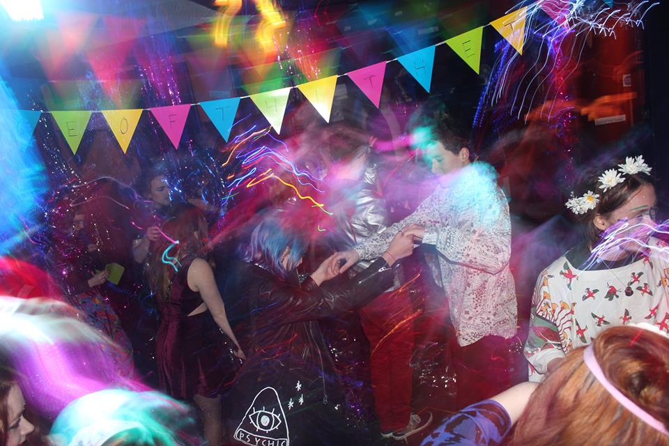
I became extremely sure of my party invite theme especially after attending an exhibition photographed similarly of Smeynes style, curated by a fellow first year LCA student, named 'The Age of The Thing' by Hollie Grace Saint-Clarke, a fine art student. Invites sent out over Facebook on the event weeks before to ensure people saved the date, and her displaying of artwork became more of a party/experience. This was due to her amazing decorating of the room, entertainment, themed music and video compilation she put together. I had never been to an exhibition like it and as you can see from the photographs, the atmosphere she created in one room, due to the over the top glittering and lighting of the room, made it other worldly. Me and friends were actually buzzing coming out of the exhibition, taking glitter tassels from the exhibition itself which everybody had been dancing with all night. This feature was unintentionally interactive but because of the buzz of everybody in the room and the flamboyant music and style of the exhibit this happened naturally.

It was a completely unique experience successful due to its planning/curating and design transporting us all to another glamorous glittery drag world for an evening! I would want to be seen as an artist that gives this thrilling and invigorating feeling to people. Photography like this makes me happy seeing others in the moment having an amazing time and is one of my favourite inspirations and influences to be part of making the moments. This reinforces the impact the way work is presented is so important and makes all the difference.


My self-confidence really needs to go above and beyond submitting my work and posting it on Instagram I feel, to really succeed in this module at University. I need to let go of past events not going as planned and just try, otherwise I'll never know. This is really hard for me but hopefully I will overcome it, as I am here to grow and develop as a person as well as a designer.