Harleyandj and Robin Eisenberg are sadly very busy as neither have responded a second time for an interview which I am hoping will do soon as they are two of my favourite artists that I follow and like on a day to day basis!
Update: Robin replied and questions have been emailed over at her request, Positive I will have an interview from her in time which is mind blowing as her work is insanely brilliant.
After contacting a handful of creatives who I admire, like suggested in our lectures, reaching out to Leeds College of Arts alumni is a brilliant idea and I feel they would be more empathetic to our situation and it is so inspiring to go on the alumni profile page and see how many there are!A couple would have been contacted by half my class by now which is a no brainer, but looking for others that share similar design interests or have gone down routes I could only dream of would be perfect to get in touch with as having a series of interviews would be more enjoyable! If I am struggling to get more than 2 successful interviews, I will contact. If not, for future I am going to contact these very talented people
Daisy Argyle
Carina Maggar
Sarah Hemingray
Monday, February 27, 2017
Monday, February 13, 2017
Artists responses
HarleyandJ- email interview sent, seemed happy to help a 'fellow budding graphic designer' out! Wanted me to email over the questions, as she is in Sydney Australia.
Tone-rsd street artist based in Leeds, preferred me to send over questions instead of meeting and got some fantastic responses and I really respect his honesty and style! Had a very pleasant conversation and I asked him to inform me of any exhibitions in the future!
Robin Eisenberg- busy but would like to do an interview and see some of my work, which is actually very stressful as I feel I don't have a consistent portfolio as of yet and she is one of my favourite illustrators! So happy she even replied. Asked if she is available to skype in the next couple of weeks or if it is easier to send her questions by email as she is based in LA.
Friday, February 10, 2017


Thirsty Planet and YCN lecture notes

Clear to see they are a well known and respected link between brands and the freshest creative ideas from creative partners put forward by YCN.

It was such an honour to actually have this direct talk on the thirsty planet brief and their brand! Having undertaken this brief, the talk really reinforced the positive selfless aim of thirsty planet and emphasis on that the Harrogate water brand wanted to give something back to less advantaged parts of the world! Milawi in particular, on which the speaker told me directly after seeing my designs to expand on my colouful patterned initial designs by looking at the clothing of the women's celebration which I did!
I appreciate the brands aim to give something back and have a guranteed donation with every recyclable bottle. It was also valuable seeing the progress of the Thirsty Planet branding and hearing directly how they felt about certain branding, that the current was perhaps too childish, identifying that a new branding needed to commence that was unique, attractive, and strong in communicating the charitable aim rather than focusing on Harrogate and having the same look of competitor water bottle campaigns and that they were open minded, therefore approaching YCN for this competition.
Studio 12 and Buttercrumble talks

Buttercrumble were a very sweet genuine partnership and I loved their mantra is to make people smile, and their emphasis on social enterprise resonated with me making me realise my ethics and goals as a designer a little more. I believe I would work on similar guidelines as I want to spread joy and add some colour to peoples lives with my designs.
Wednesday, February 8, 2017
Amsterdam photographs
Shooting pictures with a disposable camera for our first brief of the year with my focus being on Neon signage in Manchester city centre, I enjoyed so much capturing views that always catch my eye and seeing the outcomes made me proud.
From this I started to adore the idea of building collections of photographs of what catches my eye when wandering around as I feel I have an eye for the unusual. It is a gamble using film as you cannot look at what you have snapped and retake which is an exciting one chance element making the photographs more authentic in my opinion. Therefore, I bought an old Olympus and began to capture what caught my eye and also images at social events as the nostalgia will be so valuable in the future of these precious times growing up. From that first project I have been given such an important inspiration and hobby which I will be grateful for in years to come as well as now!
Perhaps next year I will collate zines of certain photographs put together to make a collection as I think my photography can be a bit different.
I was lucky to get the opportunity to visit Amsterdam recently and on expired film, I got to snap some wonderful sights. My favourite parts were quirky shop windows and guerilla stickers and street art in the centres streets. I wish to visit places as well rated for creatives such as Barcelona and Berlin to explore and see the cities underground art and get the opportunity to collect important memories beyond digital storage.


#35mm Exhibition at Old Red Bus Station

An exhibition lead by fellow graphic design student displayed his 35mm photography which I follow on Instagram, as I am really in to 35mm aswell and we both enjoy capturing the people around us as we are at university in Leeds. His work is very portraiture focused and displays current style trends in brilliant compositions and crisp but grainy detail. It was also interesting to see his shots of buildings and similar structures from all sorts of angles which were all composed very well.


Was a great turn out with a lot of support from fellow classmates, even one DJ'ing at the venue which was very convinient for the exhibition as it is a popular venue, with draws in audiences of our age group for music events and drinks. Supporting fellow creatives is very important to me.


unfortunately in red due to lighting but the shots look so professional and it is inspiring to see someone in the same position as me in education being brave enough to do an exhibtion in a local popular venue, with really refined professional shots with none looking amateur or out of place. Also this inspired me to improve on my photographing as my camera is fairly old and the flash doesn't capture night very well (which is unfortunate as that is my favourite time to shoot), and being a fan of expired film its exciting but unpredictable knowing what rolls of film come out like.
I really enjoyed the funny, generation-y captions and shots of people especially, I find capturing peoples styles at the time is one of my most interesting and valuable shots you can get as I believe people are all unique and have their own quirks and characteristics that is kept by taking a photograph.
Getting involved in local projects

This is a brilliant opportunity to get work out there to people beyond the university walls, local people of all ages who could really like someones work in the zine and this is an opportunity to gain more followers and boost my confidence enough to push my business instagram more if I feel people really enjoy my work. It also supports the amazing work Studio 12 are doing in giving those who have struggled in essential areas of life to get to uni but have that creative fire, which is what is needed at the end of the day.

Noticed this in our LCA corridor and it is perfect!! My art is very feminine and I have leftover work, for example from the line drawing responsive brief and photography which is a personal hobby of mine which I love very much. I aim to contact them and meet the girls involved as I want to see more of the creative talents in our university which has so much potential. I hope through this to exhibit designs and meet like minded and styled creatives which would make me so happy! Just having work exhibited would be such a boost for me, and to submit something fully my style. Also it is important to support and keep the exhibitions going!
Papyrus charity brief- I am so pleased we got given the opportunity to submit a line drawing in aid of young adults mental health which is a cause I would really want to get involved in enterprise wise. I am excited to submit my line drawing as it features a national treasure who cant be hated, and a tonne of animals to fill in and hopefully it can help these young adults escape their thoughts for an amount of time. I would be so so proud if I was chosen. Such a brilliant cause. This brief has also inspired me to work towards enterprising more especially in the mental health sector as I want to spread positivity and respite with my design work.
I have also taken it upon myself to try and apply for jobs at bars and cafes that hold exhibitions, or that are places creatives tend to be around a lot for the chance to network and work at the same time which is very exciting! I realise how thriving Leeds is and feel I am cornered out of where it is all happening sometimes. I want to be in the middle of it all!
I have also taken it upon myself to try and apply for jobs at bars and cafes that hold exhibitions, or that are places creatives tend to be around a lot for the chance to network and work at the same time which is very exciting! I realise how thriving Leeds is and feel I am cornered out of where it is all happening sometimes. I want to be in the middle of it all!
Monday, February 6, 2017
Studio Moross new Parklife Visuals


Yet again, Studio Moross has propelled Parklife festival in to something beyond a music festival with the advertising of it. Another amazing other wordly design galaxy walk through of the acts performing all placed so inventively every step of the way with a juicy 80s colour scheme.
Following from last years theme which became a main design inspiration for me, this is another very cool, hand drawn colour burst of so much detail going in to every frame you cannot take your eyes away from the ad. Having a different theme to work with each time would make me anticipate the project so much more: having a certain theme to follow always helps me as a designer and is why graphic design is enjoyable to me, as I like having a guide to follow, this allows the ideas to pop up. The 80's theme for this year didnt even need to be relevant to the main acts, as it becomes a visual adventure so engaging you forget!
I feel it fits the core audience so well and engages with the accompanying music and cool urban lit up city demeanor, making people feel like theyll be going to the coolest place on earth (when in reality it is a vast muddy field near to my house). This is one of the best inspirations and examples of how design can transform a brand and the vision the audience gets when being drawn in to another world due to design. Parklife did the right thing choosing a more arty route for their branding as Studio Moross have created something truly unique and I hope they continue to do this each year as i'll literally be excited for it to come out each time!
Kate Moross is one of my heroes anyway, for her similar admiration of colour popping design which strikes the eye apart from the dull and boring. Although I am not as in to drawing the symbols she is famous for, the hand drawn type and visuals are guranteed to create something so bespoke and special and it makes me excited to get in to briefs where I get a chance to illustrate as it looks like no other. Studio Moross are amazing, and although I feel i'd get no response as they are one of the highest demand design studios right now, I might send them a letter asking for an interview for our PPP interviews.
http://www.itsnicethat.com/news/studio-moross-park-life-2017-identity-030217

Interview prep/lecture and artists to contact
Now with a tonne of screenshots of artists on Instagram I follow religiously and adore the artworks of, I reach that brick wall in my mind, what do I ask them?!
I am very indecisive and unsure of what career path I want to go in, knowing my style progressively each week and knowing I don't want to start my own studio due to fear of too much responsibility, it doesn't help with knowing what to ask these amazing artists.
These are notes from the very helpful lecture on interviewing.

It was recommended by a friend and interviewer for Diss. magazine that I check out previous interviews with the artists (if any) or fellow artist to see what questions prompt the best, detailed responses. My main aim is to not bore them and myself to death, which is what I never want to do now or in my future career as life is too short!!
Beforehand, I have looked in to existing interviews with the artists to avoid repeat dull questions or prompt them to expand on a certain question to gain what I wish to know.
Also important to..
-research their history as an artist
-look at present/upcoming projects to ask about
-recommendations
As well as nervously wandering what to send Studio Moross to initiate an interview, I have also DM'd or emailed these artists who are favourites liked and seen every day on my main form of discovering new artists and being inspired, Instagram.


robin eisenberg
artist and designer who loves illustration, I admire that she has followed what she loves creating and it has been so successful, her design aesthetic resonates with gen-y women


emma fisher
People of Print favourite whos bright gradient screen prints really caught my attention and I am inspired by her themes of shape and gradients


Hattie Stewart


I am very indecisive and unsure of what career path I want to go in, knowing my style progressively each week and knowing I don't want to start my own studio due to fear of too much responsibility, it doesn't help with knowing what to ask these amazing artists.
These are notes from the very helpful lecture on interviewing.

It was recommended by a friend and interviewer for Diss. magazine that I check out previous interviews with the artists (if any) or fellow artist to see what questions prompt the best, detailed responses. My main aim is to not bore them and myself to death, which is what I never want to do now or in my future career as life is too short!!
Beforehand, I have looked in to existing interviews with the artists to avoid repeat dull questions or prompt them to expand on a certain question to gain what I wish to know.
Also important to..
-research their history as an artist
-look at present/upcoming projects to ask about
-recommendations
As well as nervously wandering what to send Studio Moross to initiate an interview, I have also DM'd or emailed these artists who are favourites liked and seen every day on my main form of discovering new artists and being inspired, Instagram.
harleyanj
majored in Vis Com in Graphic designArt Nouveau/60s/70s inspired design work
melstringer
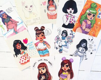
illustrator and visual artistvery cutesy, feminine illustrations featured artworks and advice in my zine last year in which I featured my favourite female artists of instagramtone_rsd
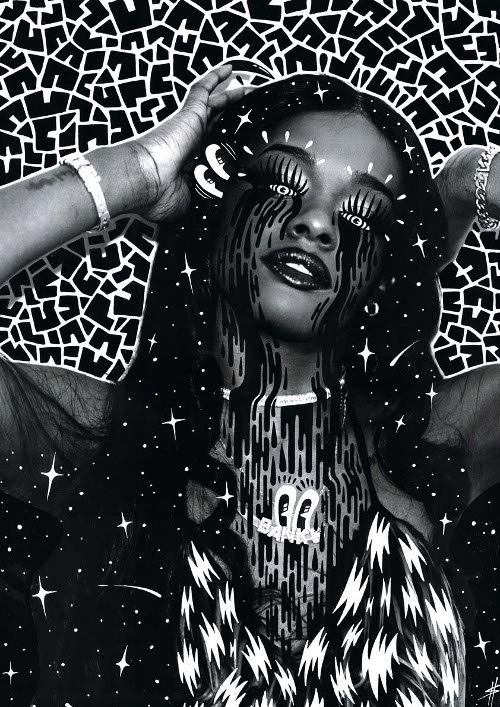
street artist who I have wanted to find so nearly a year after spotting his designs in various streets of Leeds! the striking comic style and pinup inspiration is something that I think is timeless and always looking so visually strikingpollynor
Illustrator who's 'women and their devils' style theme makes her work more unusual and personal which I am drawn to by the harsh thick lined patterned illustration with zaps of coloursupermundane
amazing versatile designer Rob Lowe's work stands out due to his works bold colour combinations and strong shape work which give a fearless and vivid uplifting presence which I aim to achieve with my design style

robin eisenberg
artist and designer who loves illustration, I admire that she has followed what she loves creating and it has been so successful, her design aesthetic resonates with gen-y women

emma fisher
People of Print favourite whos bright gradient screen prints really caught my attention and I am inspired by her themes of shape and gradients
Mike Perry


Hattie Stewart
with such distinctive recognisable illustration and pattern work, I want to know more about her inspirations for these great pieces of high energy design work done mostly over magazine cover models

Subscribe to:
Comments (Atom)