Saturday, February 27, 2016

Logo sketches


Considered stems becoming 'H' and 'R' which looked more confusing than I want for a logo, and also details that represent a cherry bomb or radiating excitement, but is probably being overcomplicated. I liked the beginning of starting to move the stem to the side which makes it distinct from other cherry logos, and having the heart cherry knot.


Thinking about adding my initials between the heart, and wether or not to have detail in the back but I believe this would make it less ambigious and once digitalized this can be a very strong logo. It would be rounded like my brand, so this is how I began to visualize how it would fit.


3rd along the bottom is the closest to it being right! Feels distinctive and not overly detailed/complicated and can see it being applied on to various party products such as cocktail glasses/stamps/posters/stickers/etc

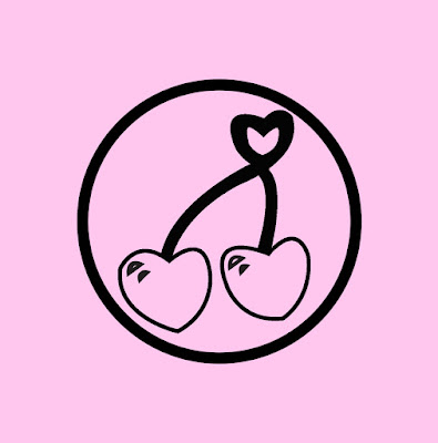
Sketched up on a coach ride I think this could be really solid logo that doesn't need the glitter and glitz of the party details, but would really be a strong stamp of my branding direction. The two cherries representing the joining of initiative, working together and having new fresh ideas. As cherry knots can look a little like a heart if I did this subtly, maybe very tiny at the top this resonates with the femininity in my designs and the positivity and good feeling I want to radiate when working with people.


Thicknesses look too imbalanced and feels empty so I decided, like in my more succesful sketches to fill in the cherries. Also, only having black with one other colour will make it easy to screenprint and make it a transferable logo.


Feel like initials make logo too busy and only trying typefaces used within my invite, Amandes Salees being my main for my brand and used here, don't have the same look on the logo although having the logo simple without initials, it is ambiguous but works with the rest of my designs.


Not overly complicated, quite solid distinctive logo of cherries representing the positivity and design that provokes thought and makes a change to peoples lives after the joining of two creatives collaborating being each cherry.


Invite Adjustments

After taking a few days away to look at mvite with a fresh vision and gaining feedback from fellow LCA students, it was suggested I make the brand part smaller as the information was becoming too condensed and as it draws the most attention anyway making it smaller wouldn't have a negative impact. The glitter gives it an interesting subtle detailing that ties in with my theme too.


My smaller body of text is too condensed and hard to read in capitals people have said, which I agree with although I am struggling to pick another typeface that doesn't look unmatched to the rest of the design like the last alternative I tried. In this I have used Helvetica which is a very versatile, legible typeface but it still feels out of place...


I then began to adjust the tracking to mimic the condensed style of the other texts but without it being overpowering and hard to read due to all capitals/tall x-height. This gives it the ease and legibility in a softer way, in which I have removed '&'s to be come across as more professional, and before I was just trying to fit the text in without leaving widow text. In medium weight which aligns with the weight of the others and is clear to read against the pink background.
For genuine emphasis effect, I have tried italics in these parts I want them to know I am addressing them specifically. Also adding a line under the RSVP gives it what it needs to stop it looking like it is  just put there floating within the invite.


Body text with 'Glober'. Am constantly adjusting and trying others to be sure. I feel this looks better in italics which seems appropriate for my message, and helveticas looks more squashed when italic.

Thursday, February 25, 2016

Study Task

I feel this is a really exciting study task as I enjoy making others feel good about themselves and weighing up their personality and characteristics visually!

"I want a brand that is manual but like modern but with newer influences" "I particularly enjoy print media" Design ideas I have initially coming to mind include having overlaying printed shapes representing the manual processes of screenprints/monoprints using manual set shapes that would be used in letterpress for example. The type of the brand can also be represented as letterpressed. Knowing Beth myself, I know she is very in to sketchbooks and the pages are always overflowing with mindmaps and ideas everywhere which could be an element drawn in. She also doodles type a lot!I see why she wants her branding to be manual and print media related as she is hands on before reaching for the Mac. Personally, unlike Beth I struggle handwrendering text the way I envision it! I began doodles that used the curls of her hair as detailing and it really wasn't working,
The idea was popping block text with hair features such as curls/headband to the bottom right...
I then decided I could use beautiful calligraphy fonts, but specifically with curled detail like she draws or very brush looking as she enjoys the practicality, 'manual', beginning aspects of design. These typefaces are very modern, 'newer influences' whereas using block type is old school. I will attempt this though as she enjoys print media.


Tilted representing her being a bit more quirky, not straight lined standard. She also was speaking of how she enjoyed Lord Whiteney's motto of 'connoisseurs of make-believe', and she is huge on clever concepts so this seemed the appropriate tagline!

No colours seem overly necessary or sprung to mind as a brand for Beth, which I think due to the calligraphy typefaces isn't missing as much and it is interesting for me to not work in colour as it is what I always jump to i feel! Despite this I had to try at least one, so I went for navy gradient as she is very formal and professional, and this coming across in your brand is essential if it is a big part of how you work. Has a subtle effect as still dark but gives the hint of professionalism as navy relates to education/businesses i'd say. Also still very clear to read. (Now aware I have spelt wrong and for final will be corrected)

Slab serif version doubled to give the impression of letter blocks using lilac detail which against a very light silvery grey, in its shape looks like a horizon/clouds with a stroke of femininity with the lilac.

Monday, February 22, 2016

Invitation Firsts


Shadow is more cherry coloured and is a highlighting detail but I feel it isnt in balance and looks harsher than others


Way too pale


I feel this would just hurt peoples eyes


More bold in colour approach is balanced whilst still bright, and reiterates the cherry brand in comparison to the previous two colour schemes which look too washed out in comparison. Although, i may change my mind once I have made my logo and added illustrations or any details, although i'm undecided on this so far. My focus was to get my layout and wording right which ties in with the party theme while wanting them want to get in touch by being warm and complimentary, making them feel special.

Using bebas neues loud quality draws attention to the words and I want my invite to be paid attention to and be memorable in comparison to other letters or invitations they receive. However, I am going to experiment in lowercase typefaces for the chunk of smaller text. I was trying to keep the amount of typefaces to maximum of 3 as it can be too busy with more. For the main content I am working with sans serifs as this is not an overly formal invitation, more of a sincere but friendly reach out to those who inspire me who would most likely not be overly formal minded themselves but more fun and out the box types. Despite this I am very conscious to not use typefaces that don't relate to my style or manner in some way.


I attempted to use a typeface with the boldness of bebas neue but not as compact and cut, and found this typeface 'Cheese Pizza' which sounds fitting for me as a person, and although it is legible I feel there are too many typefaces so I will have to get feedback on this as I can't decide!


Landscape format which reiterates the fact I need detail for the composition to be harmonised


Rough example if I were to use glitter explosion detailing

Sunday, February 21, 2016

Brand Developments


Experimentation of tones/palettes that work in harmony


It is very valuable and important to be experimenting in these variations of pinks at this design stage, but I also have plans to experiment printing my brand and logo on actual pink glittery stock hopefully! These are just how it could look, or how it could be printed as it still gives the dazzling effect without glitter getting everywhere and is cheaper/easier than acquiring the stock but I want to try anyway.


After a discussion/feedback with my mum asking how she would put me as a concept, she very interestingly suggested 'velvet claw' in which I was initially confused. I then realised she meant I am easy to get on with/smooth/elegant but have a passion and a bite to me, in which the claw came in. I admired her feedback so much which means a lot to me coming from her, but as this is to attract design partners/clients/collaboration that wouldnt be the most appropriate concept for this in particular. Therefore as velvet is one of my favourite textures I considered it as the background, but it doesn't work with this brand and design outcome of a party invitation.


My favourite is number two which has a more cherry pink which relates to the theme and also the colours are balanced right, not being too over or underwhelming. I really wanted to add a juice text effect but do not know how to do it, and cannot draw them on photoshop alone so I will seek out how to do this if I can because it relates to the fruit theme and makes the brand pop even more. My attempt was terrible.

Celebrities Who Were Graphic Designers

http://www.creativebloq.com/graphic-design/celebrities-were-designers-81412563

This post popped up on my newsfeed and it reminds me those who go in to graphic design can do so much more as they have a wide range of creative skills that come from studying graphic design and inspiration from doing so! It reminds me why I chose to do this course.

Amazing inspirations on there such as Freddie Mercury, whose influences and talent can't be argued. Although I have no musical talent whatsoever, the link between the art subjects and musicians is very important to me as they have such an impact on all of us. It is a link I would possibly consider aiming to be part of in the future, to do with music videos album artwork etc (Secret 7" has been my favourite brief as of yet due to the link).

David Bowie especially, who is one of my idols, I did not know actually studied in layout and typesetting! Although he kept this knowledge and applied it throughout his career, it wasn't what he stuck to specifically throughout his whole life. There are ways graphic design elements can be applied to anything visual! Wether it be fashion, music videos, stage performances, interior design etc. The list makes me feel better about not knowing where I want to be in particular, and reassures me it's okay if I feel a bit different to others in the class who seem to have clear, straightline graphic design goals.

Parts of my self branding notes

Collectives can be printed in polaroid format that come in party bag with their names beneath and maybe even of general artists who have inspired me over the years such as musicians/photographers/etc
Brand is Cherry On Top, logo is cherry with the meaning of two minds joining together. H and R on cherries perhaps?
Party invite, brand on pink glitter stock on one side, invite on the other
Name as header on invite side and aspects of me I recorded from ongoing peer discussions and feedback from friends and family who can see more of who I am as I can some times, put in to invitation format
Warm enthusiastic approach that is genuine and sincere for those who inspire me
Traditional with 'you are invited' 'RSVPS' inserts, with personal twist
Badge/bag/balloon/Cocktail Glasses mockups
Cake drawing with the parts of me I originally made up earlier in the project? poster idea?
Sequins/glitter in product photography to make it look like a party
Flyer inserts?
cherries on trees illustration details, organic/fresh ideas relation that are good for the world poster idea?
floral illustrative designs that represent the beautiful growth of ideas? (sounds so corny i know)
and my work is mostly very feminine unintentionally anyway
glitter explosion detail tying in with cherry bomb poster idea?

http://www.cherryfusion.co.uk/blog/2014/5/28/what-does-your-brand-name-say-about-you
Suggests more wacky names are often more memorable than name brands and sticks in long term memory.

Pink, glitter, floral, portraiture, pin up styles, colourful, positive, warm energy

Party Invite Inspo

Cherry Shaped that opens up at the two cherries?


Has the excitement within its design that sets it apart from standard more boring invites. Has the party aspect and theme is versatile and distinctive

Screenprint could be an option once I have learnt how to do it


Paper punched confetti, perhaps could make a party bag with these and sequins with invite party rings etc


Photography arrangement really extenuates and makes this it's best possible quality in terms of theme and impact of it


embossing?


Envelope? these are really inspiring more minimal ways of laying invite out, and would be appropriate as I want the invite side to contrast the bold side with self branding and glitter stock


Has the handwritten look I want to go for tying in with pink in a non-overpowering way. I need to learn myself how to have a minimal balance applied to my work