I have always been so curious and intrigued to buy a zine like Polyester as their modern day 90s born girl themes and outlandishly striking photography and art direction has stood out to me always, and looks like the type of projects i'd enjoy to work with in the future. However, I have been judging a zine by it's covers literally and thought it was about time I actually read in to the content to see if I could make contact with the makers for interviews or potential placements in third year. I also need to buy Mushpit to compare, which was unfortunately sold out at the time of buying!
This cover in particular is very feminine, with nostalgic pixel writing not conventionally used for legibility in design but adds to the subcultural aspect of the publications audience. I always really enjoy their used of clashing borders, always done in a way that amplifies the model photograph and is fun to view.
The introduction within goes straight to the editors dismay of the recent political changes and how she has found solace and comfort through artists, finding hope and inspiration in an art bubble which I can relate to as well as the target audience of young women like me with an interest in the creative sphere I imagine. It is very radical feminist which is a bit too far for me personally but I can appreciate their passion.
Double page spreads of art work are immediately thrown in which is always pleasing, in this case celebrating female artists. The interviews are with underground artists in which the interviews are mildly inspirational but are nothing I really connect to probably as I don't see them as relatable to any work I want to achieve, apart from a section with a photographer focusing on the un-touched female body which I may look at for my dissertation.
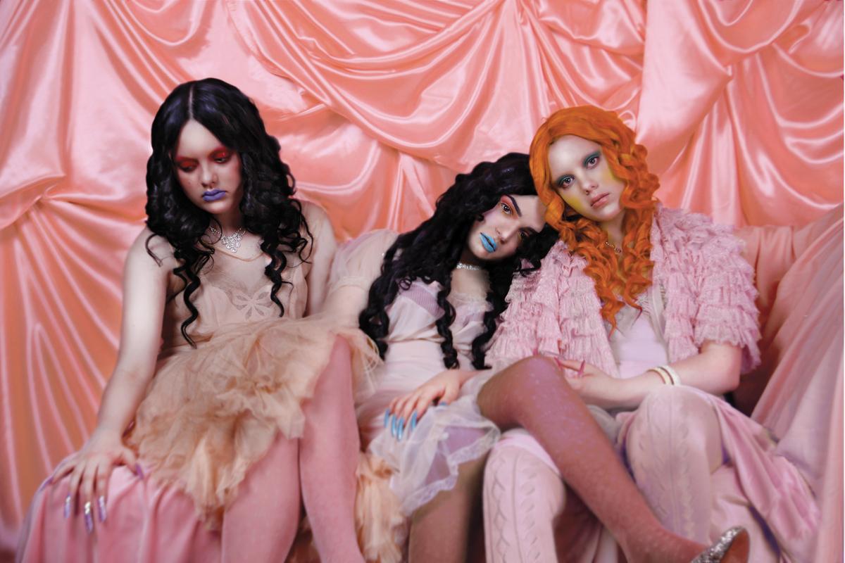
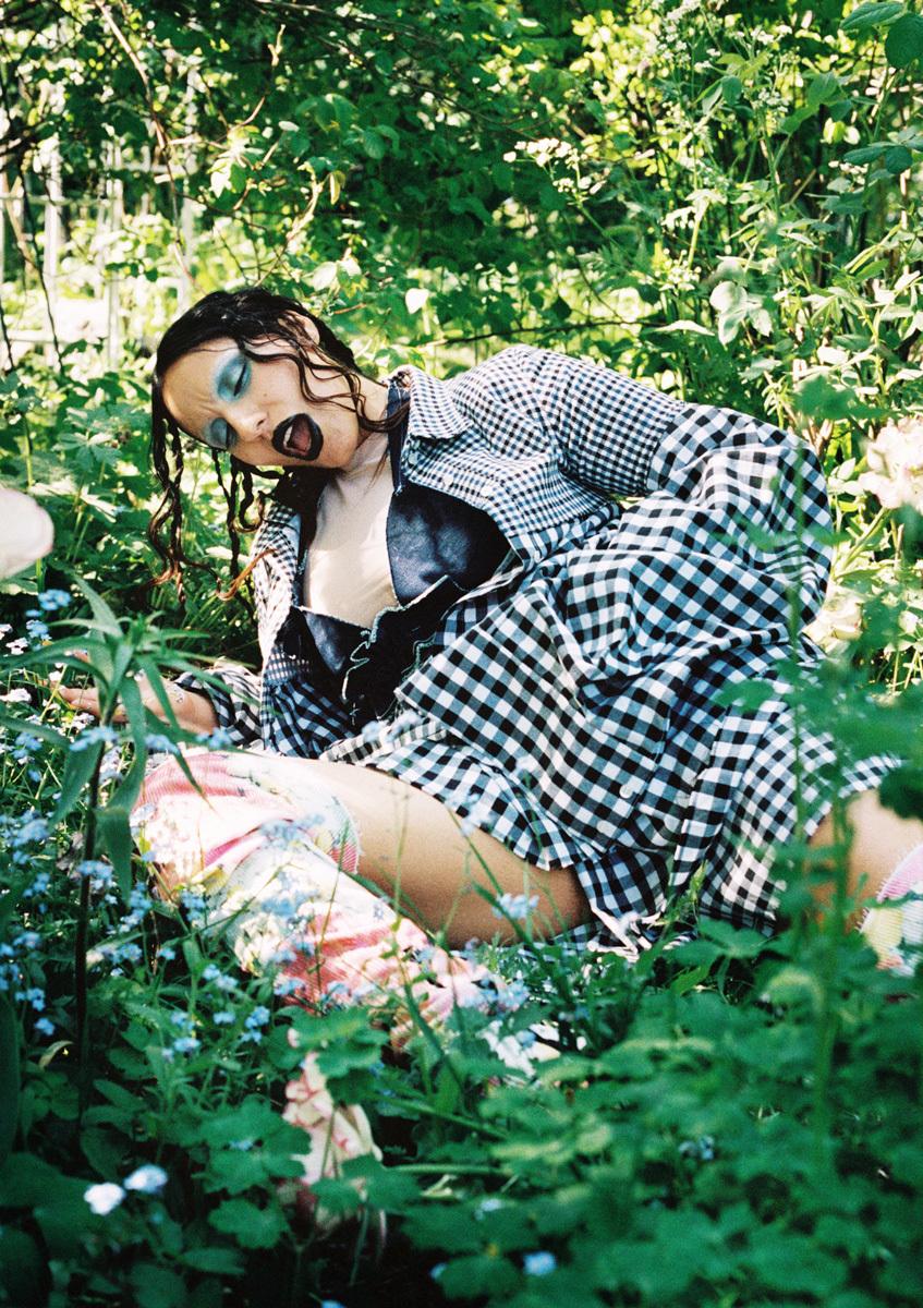
Despite the interviews being mildly vain and not appealing to me, I admire the variety of layout design throughout and the photography to me is beautiful. I adore the tarnished feminine style of the shoots and are the kind of photoshoots I want to do in the future, as styling and art direction is another sector I haven't explored a lot just yet, and in future getting in touch with their art directors featured would be a go to.
Overall, I enjoyed this zine for the aesthetics rather than the content, which is still a valuable source to draw from as it is so unique and excites me in the style it is designed in! This gives me layout ideas for publication, art direction inspiration, ways in which I can edit, all towards working in more of a style I enjoy. The photography is so beautiful I will continue to buy issues every now and again, and collect these images to put up or collate for inspiration!
artists to contact
https://i-d.vice.com/en_gb/topic/ashley-armitage
http://cargocollective.com/lewisvorn/CYBER-ANGELS-DIGITAL-DAZE-POLYESTER-ZINE


No comments:
Post a Comment